The word “hipster” has developed an interesting stigma. Let’s be real here, those flannel wearing, craft IPA and coffee loving, bearded, vintage Canon owners have awesome Instagram feeds.
It’s okay to admit it; we’ve all been there before -- we find ourselves stalking someone’s Instagram feed and feeling slightly upset and jealous of how perfectly simple it is. Yeah, story of my life.
We’ve all seen them at one point or another: freakishly symmetrical birds-eye-view coffee cups with perfect espresso crema or beautifully crafted latte art, under saturated succulents, and many, many peonies.
Now, I use the term “hipsteresque” in a very loose manner. You may instantly think I’m talking about millennials, which is not the case. I'm talking about a particular style revolved around simplicity that's making a huge sweep across visual social media platforms like Instagram.
What exactly does this have to do with your social media strategy? First, it's important to ask if your business should be on Instagram in the first place, but if you decide to go that route, stylizing your pictures isn’t just about having a cool-looking Instagram feed. Don’t get me wrong, that is a huge plus. However, posting quality visual content on a platform like Instagram will create trust between you and your prospect.
With all of that being said, before we get to the how, we need to understand the why.
The Importance of Drawing Inspiration
Before we head into the more technical side of things, I want to touch on a very important topic that we as content creators need to keep in mind when in design mode.
We learn and draw inspiration from the work of others. In whatever craft you do (whether it be photography, music, marketing, public speaking and so on) there is probably someone in your particular industry whose work has evoked some sort of emotion or inspired you. Take that style that has inspired you and tailor it to fit your, or your company's, own story and taste.
The Importance of Posting Creative, Quality Content
At its foundation, Instagram is a visually driven, creative, social media platform. It's the perfect place for your brand to show personality and create a personal connection with prospects.
Here are a few examples of brands killing the Instagram game with their social media strategy, and others, not so much.
Rachel Allene, a local photographer and calligraphy artist here in Chico, California has mastered the art of product stylization.
Rachel is in a very visually driven industry. She could have very well just posted pictures of her lettering alone or shared pictures of her photography clients.
Instead, she decided to combine her two services by stylizing her calligraphy and taking gorgeous pictures to promote her prints.

There is a tasteful way to reach the millions of active Instagram users and Vans did not accomplish that in this post.
There are one million other ways Vans could have chosen to stylize this picture. However, they decided to post a plain ‘ole advertisement instead.

Now that we have gone over why we put time into visual content, here are a few tips and tools for small business owners and marketers that are trying to stylize their Instagram feeds.
Understanding Photography Fundamentals
We live in a point-and-shoot world, which is not necessarily a bad thing. However, when we're taking pictures for our businesses with our iPhones or Androids, we should be careful about overlooking the artistic aspect within the post.
Here are a few photo fundamentals to help you start this practice.
- Rule of thirds: One of the most fundamental elements of photography is the rule of thirds. The rule of thirds breaks your photos up into 9 equal parts, with 4 points of focus and 4 lines that you can alighn your subjects up with.

4 points of focus [Provided by Darren Rowse]

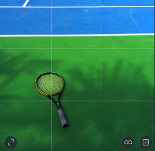
Thankfully, Instagram makes using this thirds rule very easy with their own grid that you can use while capturing your photos.
Here is an example of the thirds rule in action. If you study closely, I placed the head of the racket in one of the subject aligning lines. Additionally, I placed the Wilson logo near a point of focus
 [Provided by @maliahmonica via Instagram]
With all of that being said, there's nothing saying you have to follow this rule. As put by Darren Rowe “If you intend to break a rule you should always learn it first to make sure your breaking of it is all the more effective!”
- Photo Post Production Basics
Okay, I can almost guarantee that most of these gorgeous pictures we see on Instagram are #NoFilter. If you study closely, some of them seem a little washed out and others seem very vibrant. Welcome to the world of post production and editing.
Now, be aware that these are only two elements of photography post production, but they are significant ones. If you would like a more in-depth article on editing and post production tips, check out this blog.
Let’s begin with contrast. In simple terms, contrast is the difference between dark and light colors in your photo.
If contrast didn’t exist, you wouldn’t have a photo because you wouldn’t be able to tell the difference between colors.
Here is an example of what increased and decreased contrast looks like.
High contrast: Notice how the colors seem much more vibrant. You can easily differentiate between the blue, green, and black.

Low contrast: When contrast is removed, the photo gets a little washed out or flat. This can be a good or bad thing depending on your taste. Although they are still apparent, you can’t pick out the palm tree shadows as easily.

Saturation is similar to contrast, however instead of emphasizing the separation between shadows, there is a separation between colors. When applied, desaturation and oversaturation look as such:
Desaturation:

Oversaturation:

Editing Applications
A social media strategy isn't complete without a mobile element, especially Instagram. Now that we have gone over a few editing essentials, here are a few great iOS and Android applications you can use to edit photos right from your phone.
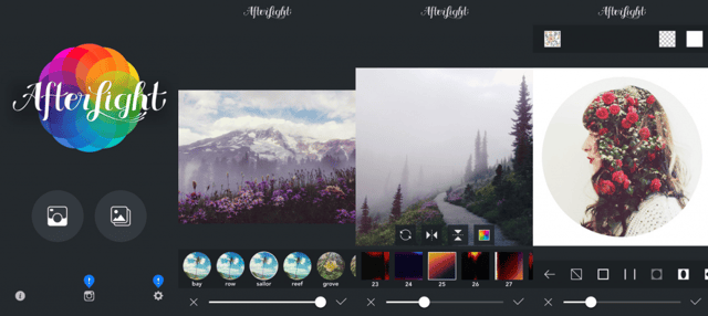
- Afterlight: $.99 in the iTunes App Store
With over 80 filters, 80 textures, as well as the ability to manually adjust your brightness, contrast exposure, saturation and other features, it doesn’t get much better than Afterlight.

[Photo by careergirldaily.com]
- VSCO: VSCO Cam functions in a few different ways. It has the ability to take photos through the app, as well as edit your photos. What many people don’t realize is VSCO is actually a social platform in itself. Very neat!
VSCO is perfect for new and seasoned iPhone photographers alike. VSCO gives you complete control over settings like ISO, shutter speed, white balance, exposure, focus and much more.
Here's a video to help break down those features.
Shooting Tips
- Simplicity: The number one mistake Instagram users make when trying to recreate this style is forgetting that it is centered around simplicity. Don’t over clutter your pictures; no one can focus on your product if there are one million other random objects in your post. Less is more!
- Birds eye view shooting: Be bold, be brave! Don’t be ashamed to stand up on chairs to catch that perfect birds eye view shot of your product.
- Centered shooting: Another point of focus that wasn’t brought to attention on the grid previously shown was the center of your photos. Now this can be a tricky concept, because it can get awkward very quickly.
Here are a few examples.
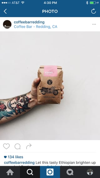
This photo is a major win by The Coffee Bar in Redding, California. What a gorgeous photo! The use of whitespace highlights the product. The tattoos add a nice touch as well.

Here is another great example of this center shooting concept. The symmetry in this photo is astonishing. Theron Humphrey has a following of 1.2 million on Instagram. His subject? His adorable dog, Maddie.

[Photo by @thiswildidea via Instagram]
Here is an example of what not to do.
It pains me to admit, however, this is a photo from my own profile. I snapped it to highlight a significant moment for my music students, although, I think it still serves as a great what-not-to-do example.

Now, what's wrong with this photo? I could not have picked an uglier object for the middle of this picture.
Stylizing your pictures has part of your social media strategy helps to brand your business over platforms like Instagram. Remember, rules (in the context of art) are nothing more than strong suggestions. This guide isn't a "How To" rather than a "How It Has Been Done Before."
We get that mananging social media your own business is a big, time consuming task. If you'd like help with your strategy, contact us today! We'd love to partner with you.


