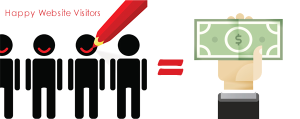
When someone talks about wanting to increase website conversion it sounds like a pretty technical marketing tactic; however what people don’t realize is this attention to detail can really benefit your customers and your business. Customizing pages for conversion helps streamline your pages to create one cohesive design and flow for customers. Meaning your website visitors won’t have to guess where to go or what to do. Taking the guess work out of your website will bring you more customers and even more happiness.
What is a Website Conversion
A conversion is any potential customers that buy from you. In the context of a website, it is usually the number of visitors that make a purchase, download, or click. Many websites concentrate solely on increasing the number of visitors they have, when often they have fairly simple problems with their site that, if solved, would have a huge effect on their conversion rate and improve their site's bottom line at minimal expense.
6 Ways to Increase Website Conversion and Make Life Better for Everyone!
- Customers won't be confused on what to do or where to go on your website.
- Customers will see your company as professional.
- Customers will understand exactly what they are getting from you.
- Your employees will feel more accomplished because you can track their efforts.
- You will be happier by increasing conversions and getting more customers.
- You won’t stress out on marketing budgets because you can track your conversions and ROI.

How Can Website Conversion Marketing Help the Usability of Your Site?
If your potential customers want to find out more before they buy, can they? Is it obvious to the user where to go to find the technical specs on your products? Are they online at all? Are they in PDF format? Can users even find your products in the first place? This is probably the most common mistake I see on any website - a complete failure to think of what the user wants and needs, and how they might use a site. Plenty of sites have product pages with a photo and some sales pattern - and nothing else. Anything from 1% to 99% of potential sales can be lost through poor usability. (Source: AddedBytes)
"Conversion rates increase when your goals and your users’ goals meet."
Examples of Website Conversion
If it feels like your website is laying down on the job and isn’t bringing you any business, then something is wrong. You should know exactly how many conversions your website is bringing you, and how your users (customers) feel when visiting your site. Help customers know exactly what to do and where to go by chatting with us about your website conversion.
Related Articles:
Increase Website Conversion with These 5 Design Tricks
What Makes a Good Website That Will Blow Your Competition Out of the Water?


