
 In thinking about what makes a good website, one reality that needs to be taken into account is how different people see and interact with visual data in their world. While it is more complex than this, to keep things simple let’s talk about “word people” versus “picture people.”
People visiting your website will be naturally drawn either to images (photographs, charts, infographics etc.) or words. You won’t know which they are, so your site needs to be able to draw both in.
A good web design needs to tell your story using both images and words.
The photos you use need to make sense to the product or service you are offering, as well as evoke the type of emotional response you hope to gain from your visitor. Your images should describe your company’s personality. Are you formal or informal, corporate or non-corporate, serious or light hearted? Your choice of images, whether stock or proprietary, must convey this well.
Your words must also bring clarity to your story.
You have to step outside your expertise and ask if someone who is not in your field understands what you say you do. Many companies allow their technical people to write content for their websites, and the result is a website that makes great sense inside your organization, but not so much sense from the outside. We call this the disease of the expert. I know you have had the experience more than once of visiting a website and being unclear exactly what they do or sell. It is crazy making and is a key reason why companies like mine exist, to bring clarity and simplicity to the words you say about yourself.
A simple real-life illustration on words versus visuals might help you understand this aspect of what makes a good website.
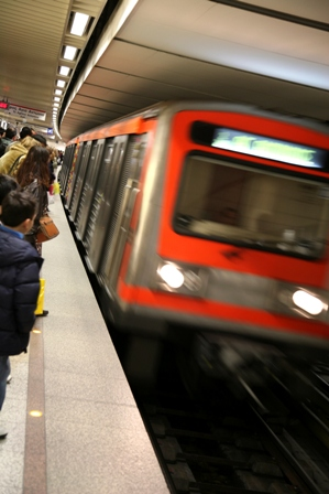
 In late August I was in Boston with my husband/business partner at a conference, and we had the opportunity to ride the Boston Underground, or the “T” as they refer to it. We are huge fans of public transit in places where it is good, and have had a lot of experience with the London Underground, so were excited to give the T a try. For the sake of context, you have to know that Michael is a directions guy. Not the guy who doesn’t know where he is going and won’t ask directions, rather a guy who rarely gets turned around. If he has been somewhere once, he can find it again, even years later, and almost always because of visual cues he picks up in the environment. It has always amazed me since I am sadly the opposite, and can get turned around very easily just about anywhere!
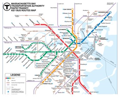
When it comes to the Underground, however, Michael struggles a bit with sorting out which platform to be on and which direction to go, whereas I have no trouble at all. Before Boston we assumed that I was just more comfortable in the UK because of growing up there, but we discovered that the same thing was true on the T as on the London Underground. Our realization was this: Michael is a picture/visual person, and I am a words person. The Underground Maps are designed best for word people. All you have to know is the terminus point of the train and you know which way to go. I can pick that up without any challenge at all because I see words quickly, but in this words designed arena, it takes Michael longer.
I’ll confess here that since I rarely know where I’m going, it feels kind of good, and I think I’m going to start lobbying for an underground in Chico. Having said that, since we live most of our lives above ground, Michael will be fully in charge of directions in the foreseeable future!
A long story for a simple point.
What makes a good website design is one that takes into account both types of people and helps all of us to understand the story of your company no matter what our preference. A bit of advice. Let someone outside your company review your website content. Find both a words person and a visual person and see if they learn what you want them to learn from what you have in place. If not, start strategizing on how to change that.
Happy story telling with your website!
Related Articles:
5 Design Elements That Will Increase Website Conversion [Infographic]
How to Add Keywords to a Website Without Looking Like a Chump


