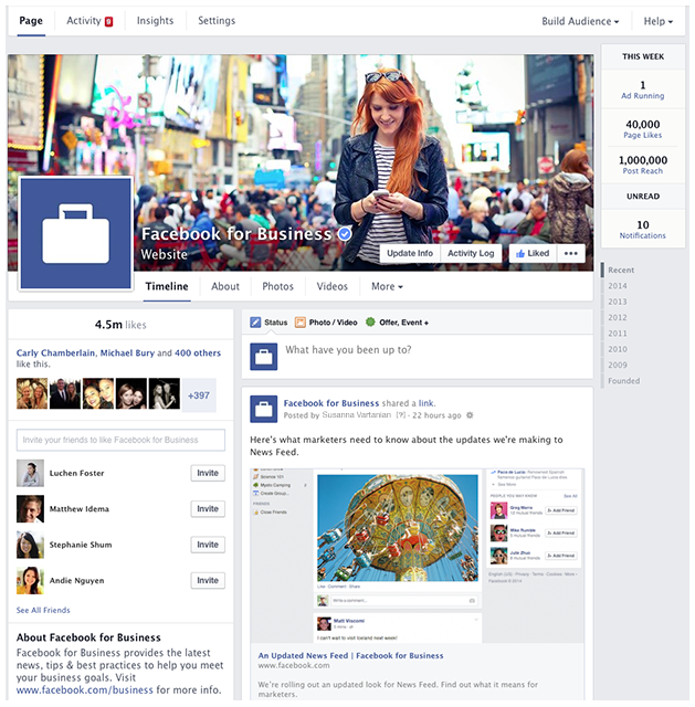
Facebook announced Monday that the look of business pages will change starting this week. They will no longer be two columns, which often look jumbled anyway, in my opinion. They will now be only one column. Take a look at your own profile page—business pages will look similar to that.
Facebook says they are rolling out this new look in order to make it easier for people to view and find information on a business page but also to make it easier for the admins. In my opinion, I think this is merely only the beginning for a series of changes for business pages on Facebook.
The right side of the page will display all of the page posts while the left side will have boxes with your businesses information such as website, location, hours, phone number, etc.
Do you want to learn more about the specific changes within the design update on Facebook? Check out this blog post from HubSpot that outlines each aspect of the update.
Posted by Ginny Soskey, HubSpot
Additions and Subtractions to Facebook Page Features
When Facebook switched up this layout, not all features got transferred over. What's missing? If you guessed "Custom Tabs," you'd be right.
From the screenshots Facebook provided, it's unclear where the heck those little boxes went, though folks are speculating they're under "More." Regardless of where they went, they're now not in your Page's prime real estate, so it'd be wise to reevaluate the time you're spending on them. It may not be worth the investment you're putting in if you're not getting any people to view the tabs.
Besides the visual changes, Facebook also added a new competitive monitoring report called "Pages to Watch," located in the 'Overview' tab of your Page insights. You add the Pages you'd like to watch to that dashboard, and you can see how their Likes and engagement have changed over the past week. Here's what that report looks like:
Some companies may feel uncomfortable that their Facebook data could be available to competitors, but the data is pretty high-level, so I wouldn't get too squeamish about it.
And that's pretty much it, folks. Nothing too groundbreaking here, but these updates could help give your Facebook Page the performance boost you've been vying for. Adapt your social marketing to fit the new features, and you'll be in great shape.
[Continue Reading Original: Facebook Updates Company Page Design and Introduces “Pages to Watch”]
Related Posts:
Is Your Facebook Campaign Successful?
I Don’t Get It – Why is Social Media Important? | Business Q&A
Facebook says they are rolling out this new look in order to make it easier for people to view and find information on a business page but also to make it easier for the admins. In my opinion, I think this is merely only the beginning for a series of changes for business pages on Facebook.
The right side of the page will display all of the page posts while the left side will have boxes with your businesses information such as website, location, hours, phone number, etc.

With a design change, will a new algorithm also come? It wouldn’t be a surprise, that’s for sure! There’s already talk that Facebook’s decline is coming much sooner that we all thought. I suppose we will just have to wait and see and continue to post as businesses, hoping our content reaches our audience or buy into Facebook’s tools like promoted posts.
Do you want to learn more about the specific changes within the design update on Facebook? Check out this blog post from HubSpot that outlines each aspect of the update.
Posted by Ginny Soskey, HubSpot
Facebook Updates Company Page Design and Introduces “Pages to Watch”
Additions and Subtractions to Facebook Page Features
When Facebook switched up this layout, not all features got transferred over. What's missing? If you guessed "Custom Tabs," you'd be right.
From the screenshots Facebook provided, it's unclear where the heck those little boxes went, though folks are speculating they're under "More." Regardless of where they went, they're now not in your Page's prime real estate, so it'd be wise to reevaluate the time you're spending on them. It may not be worth the investment you're putting in if you're not getting any people to view the tabs.
Besides the visual changes, Facebook also added a new competitive monitoring report called "Pages to Watch," located in the 'Overview' tab of your Page insights. You add the Pages you'd like to watch to that dashboard, and you can see how their Likes and engagement have changed over the past week. Here's what that report looks like:

This report is the most interesting part of this new Page update to me. Having competitor data within Facebook insights could make the data way more valuable to companies looking to go head to head with similar companies. (Noticing that your competitor is getting a lot of Likes this week? See what they're doing, and think about ways you can replicate -- and improve -- on those tactics.)
Some companies may feel uncomfortable that their Facebook data could be available to competitors, but the data is pretty high-level, so I wouldn't get too squeamish about it.
And that's pretty much it, folks. Nothing too groundbreaking here, but these updates could help give your Facebook Page the performance boost you've been vying for. Adapt your social marketing to fit the new features, and you'll be in great shape.
[Continue Reading Original: Facebook Updates Company Page Design and Introduces “Pages to Watch”]
Related Posts:
Is Your Facebook Campaign Successful?
I Don’t Get It – Why is Social Media Important? | Business Q&A


