 What makes a good website? Well, it’s many things but in this blog I am specifically going to talk about how easy navigation makes a website look better and ultimately do better.
As humans we are mostly visual people. When we first come to a website we expect (well, maybe hope) to see something visually pleasing that will also be easy to navigate, and have content that will tell us what to do and where to go. In this blog I will highlight three companies that understand easy navigation is one important aspect of what makes a good website.
I am going to stick to examples of local companies that have great websites because us Chicoans support one another. Why not when we have such talent to showcase right here in our own town?
1. Lulu*s

Lulu*s clothing company started off as a small shop in Chico, California, the same town where Half a Bubble Out is located. While its warehouse is still here, it has grown to be one of the largest online clothing stores in the United States. Very cool! I value that it keep its local roots by continuing to hire and work out of Chico.
Lulu*s has got it going on. When it comes to its website, it is clean and very easy to navigate. Everything has a tab and nothing is left for the user to be guessing. You want the user to not have to think much about where they are going, it should be easy. The longer they are trying to figure out where they are going the more likely it is you are going to lose them.
Remember, it’s easy for them to press the back button and go elsewhere.
Another thing that makes me very happy to see along with all the other social media geeks out there is that Lulu*s has buttons to Pinterest, Twitter, Facebook and Instragram easily accessible.
2. Sierra Nevada Brewing Company

If you’re over the age of 21, I am sure you have probably heard of Sierra Nevada Brewing Company. Yep! That’s right Sierra Nevada is in the same town as Half a Bubble Out. Score, right?!
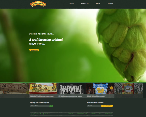
Sierra Nevada has realized it takes more than just having ridiculously good beer, and its website showcases this. Within the last year it has revamped its website, and I must say, bravo!
By looking at the homepage (after confirming you are 21 on a pre-page) you can see that it is crisp, not a lot going on and easy to navigate—yet, very visual and interactive. What you can’t see from this screenshot is that the background moves and shows different shots of the hop fields. Most of the time I would say do not have something that plays instantly, such as music or a video, but Sierra Nevada breaks the rules just right. It’s not too flashy and doesn’t take away from the navigation on the website.
I suggest you go take a look at the site to fully experience it. The only thing I would change is the size of the social media buttons at the bottom. Sierra Nevada has a great social media presence so I’m not quite sure why it’s hiding the Twitter and Facebook buttons by making them so tiny and at the very bottom of the page.
Nonetheless, great website. Hmm..anyone else feel like a Pale Ale now? Weird.
3. Build.com

Here’s another majorly successful Chico business that also knows what makes a good website. Build.com started out small but just like the other companies (hmm, I see a trend with Chico companies here…) it exploded and is one of the largest online home improvement websites.
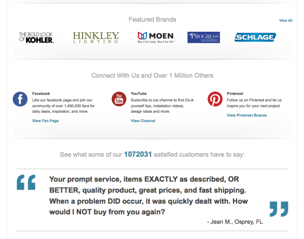
Similar to LuLu*s’ website it has the tabs at the top to direct the user where they want to be on the site. A not too distracting photo is showcased on the homepage and below it some other attributes of the site are highlighted such as a learning center, testimonials, featured brands, and the social media buttons. Reading this, that may sound like a lot of content, and actually it is, but Build.com keeps it clean and organized.

So, there you go! I would encourage you to go check out these websites for tips on what makes a good website. Don’t be afraid to borrow ideas and make them into your own when designing your website.
What other components do you think make a good website?
Related posts:
Using Public Transit to Understand What Makes a Good Website


