
 Are dogs or landing pages part of your internet marketing strategy? Our dog Backup became part of our office “staff” in December 2010 when she was just 8 weeks old. It’s true…she’s on the website as part of the team and everything. (www.halfabubbleout.com/about-us/our-team).
Backup is a key player in our office dynamic and in our overall office complex. The delivery folks (FedEx, UPS, US Postal Service and especially the payroll courier) LOVE the dog. Today the courier from our payroll company came to deliver that most desired of all envelopes, and the love fest began. Just moments before though, I watched a woman get out of her car, greet Backup with great enthusiasm, then head to another office in our complex. I have no idea who the woman was, but she wasn’t here to see us. It occurred to me that Backup is like our physical “landing page” as she lounges around outside our front door. But would she qualify to be part of the “best landing pages” club? Well, let’s evaluate some simple criteria:
Single Focus
The best landing pages have a single focus. They are designed to draw your prospect in and help move them towards a decision around a single topic or need that they have and your company can meet. Tempted though we may be to add all sorts of extra stuff to landing pages, the more they are single focused the better they are able to convert your leads into customers. Avoid putting navigation in to your website on the landing page. If you give them too many shiny objects to chase, they may move away from what you want them to do.
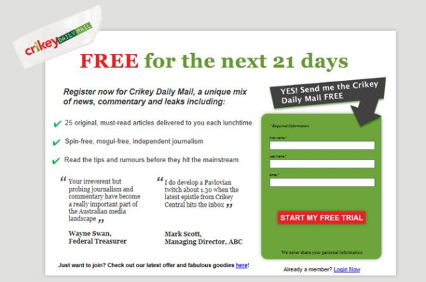
This Australian site does this single focus really well. I have zero doubt about what they want me to do
Does Backup meet this criteria? Indeed she does too! When someone comes to visit she is single minded about her desire for their attention and she does not let up until she has it.
Great Graphic
Another component of the best landing pages is that they have engaging images that draw your attention and interest. Sometimes those images are directly related to the topic at hand, and sometimes they are more abstract but with purpose. Make sure that your graphic is placed to elicit the response that you want to your offer.
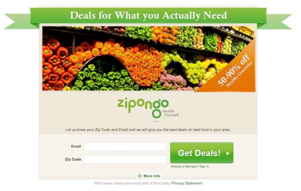
I love this landing page. The colors draw me in, the graphic makes me long for fresh veggies, and again, the clarity is in place as you move from the graphic to the rest of the page.
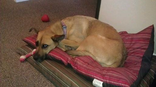
Backup definitely meets this criteria. Who wouldn’t love this face, even now that she isn’t a pup anymore? She draws you in and calls you to further interaction.
Simple Answer to the Question: What Do You Want Me to Do Next?
Again, the goal of a well-designed landing page is to encourage the visitor to take action. There needs to be a simple and clear Call to Action (CTA) on the site. The text needs to be clear and compelling, and the action steps and results made very plain to the viewer. Many websites don’t convert leads to customers because it is unclear to the lead what action you want them to take.
In the complexity of a full website that might be marginally forgivable, but in landing page world, it is criminal. Landing pages were born out of the desire to meet a need for simplified selling, and the best landing pages never veer from that single goal. Simplify the path for the consumer so that they can take the next step with your company. Both of the examples above have done this well. The CTA is strong and clear, and it is easy to know what the intended next step is. The longer and more involved your landing page is, the more challenging this can become, so be sure to do the 5 second test. If someone just glances for 5 seconds will they know what to do?
Backup’s score? A+. There is never any doubt in her face, body language and speech (yes, she definitely talks) what she wants you to do next.
Solid Conversion Rates Over Time
No matter the design, the text, the focus and the concept, the bottom line is that the best landing pages convert your visitors to leads. They actually fulfill their role and get a solid percentage of visitors to do exactly what you want them to do, whether fill out a form, order a product, call your company, set up an appointment etc. Great companies are willing to test and measure their landing pages in their marketing campaign to make sure that they are converting well. A solid target for landing page conversion is 20%. The best landing pages often convert at a much higher percentage. This is the key reason landing pages are becoming more and more used on the internet as an extension of company websites. Design them well, follow the rules of single focus, great graphic and clear direction for action, and their conversion rate tends to be a lot higher than other forms of marketing promotion.
How does Backup do? Well, the reality is that when visitors come to our office complex she has single focus, provides a compelling visual, and is clear on next steps for visitors. However, at the conversion place she falls down. Visitors come, see her, engage her and even enjoy the process, but then they walk into the insurance office next door, or the eye doctor on the other side!
As a landing page, she would probably have to go due to her lack of conversion success, but as an office greeter she is doing a great job! Backup’s internet marketing advice for you today: Check out the conversion measurements on your landing page and make sure they are doing the job they are designed to do. If not, review the rules on best landing pages, scrap what you have and take another shot!


