 Having landing pages on your website is crucial to generating new leads and growing your business clientele. However, having an effective landing page requires knowing what to put on the page and what to not put on the page. The debate about leaving or removing the navigation on your landing page has been an ongoing one—so let’s settle it.
First off, lets go over some best practices when it comes to creating a landing page:
- Write clear, concise, compelling headers
- Explain the offer
- Use 3-5 bullet points
- Short form, where the length mirrors the value of the offer
- Include a relevant image
- Place content above the fold
- Remove navigation and links
- Redirect form submission to a thank you page
- Include social sharing
All of these elements will help you to gain leads and their information so that you can potentially lead them down the funnel and convert them into customers. However, if even one of those elements are off it could cause them to leave the page and not fill out the form. Not giving them an option with a navigation allows them to be more focused on the one action they are performing.
In a recent blog post from HubSpot they put landing page navigation to the test to settle the debate. They took different websites in different industries and A/B tested different theories. If you’ve been debating with this idea yourself, this is a must-read.
Posted by Diana Urban, HubSpot
The Results of Our A/B Test
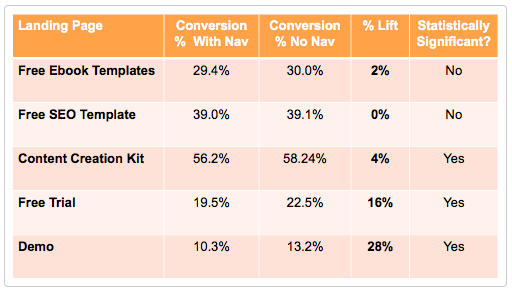
This A/B test revealed that removing links from landing pages increases conversion rates. Here's what the raw data looked like:
 Image from HubSpot
The first three landing pages include top-of-the-funnel (TOFU) offers: free content designed to acquire new leads and provide them with tools that can help them solve their marketing challenges. The last two landing pages include middle-of-the-funnel (MOFU) offers: exposure to the HubSpot software and a connection to our sales team.
Interestingly enough, removing external links had a much bigger impact on the MOFU landing pages. While the TOFU landing pages saw a 0-4% bump in conversion rate, MOFU landing pages had a 16% and 28% lift.
Even though the TOFU increase was small, for HubSpot, it has a major impact.
Let's say a HubSpot TOFU landing page gets 50K views, which is usual for us. If we increase the conversion rate of the landing page 2%, we'll get 1K more leads -- just by removing links. That's a fairly easy change to make.
[Read the original: Should You Remove Navigation From Your Landing Pages? Data Reveals the Answer]


