

Having call-to-action buttons on your website is a vital part of your internet marketing strategy. They act as a vessel on your website that allows lead conversion to take place 24/7. Why wouldn’t you have them?
However, it’s not as easy as just slapping on a CTA some place on your website and hoping people find it, click on it and fill out the form to view your content. We wish, right!?
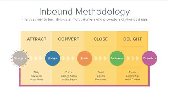
Having successful CTAs takes work and strategy. Hold on, rewind. What is a call-to-action you ask? It’s all about converting those possible leads to customers and guiding them down the inbound funnel.
A recent Copyblogger blog post by Joanna Wiebe sums up the important of CTA’s very clearly. Check out all of the examples of a good CTA and how to successfully implement them into your internet marketing strategy to gain leads.
Posted by Joanna Wiebe
Visitors who don't click don't convert.
As marketers, we know this to be true.
Your visitors can't get through your checkout process or signup form without clicking at least one button. And that one button -- like all of your buttons -- can be improved on.
But we fail to optimize calls to action for pretty simple reasons, all of which are complete BS.
We need to stop ignoring the so-called "small things," especially when conversions depend on them.
Instead, apply a few of the following click-boosting techniques in this post, which
A/B tests have proven can generate conversion boosts ranging from 20 to 95 percent.
No more excuses
See if you can relate to any of these excuses for failing to optimize calls to action:
- It's hard to get creative when you've only got room for two or three words on a button
- Everything seems best summarized as "Learn More," "Sign Up," or "Buy Now"
- If people really want my stuff, the button isn't going to make or break a conversion
- Buttons are small -- we've got bigger fish to fry than that!
Those excuses are like a ceiling blocking your conversion rate from lifting. Your call to action isn't supposed to summarize ... it's supposed to get people to act.
You shouldn't limit your button copy to a three-word maximum. A button that fits the standards of every one-percent-converting site should not be the button you expose to your hard-won visitors. You're not writing copy for visitors who would walk over hot coals to get your stuff. You are most often writing for people who are on the fence and who can be pulled over to your patch of grass with great messages.
[by Joanna Wiebe from CopyBlogger]
[Read original: 6 Proven Ways to Boost the Conversion Rates of Your Call-to-Action Buttons]


