5 Tips for Killer Calls-to-Action
 What motivates you to do something? Do you take action based on how you feel? The way something looks? By doing what someone tells you to do? You may not know it, but subconsciously you make decisions big and small every day by answering those questions. Here’s a scenario for you, and just stay with me. As an internet marketing consultant I promise to relate it back to internet marketing. You’re going out to dinner and you get to choose the restaurant. You probably ask yourself, “what do I feel like eating?” When you look at the menu, and there’s a photo next to the day’s special, you might think “that looks good, I’ll have the special.” Or maybe your date is scanning the latest reviews on Yelp and says “oh, you should try the steak – it got great feedback!” What I’m getting at is that when you are making a decision, you are being influenced in different ways to take some kind of action.
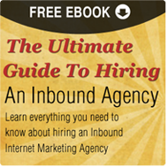
First, let’s define what a call-to-action is and why you should use them. Calls to action, also known as CTAs, appear on your website to help direct customers to do something, like download an offer. Their purpose is to drive traffic to the landing page containing the offer. Essentially, a call-to-action is the bridge that takes your customers from your website to your landing page. Below is an example of one of the calls to action we use at Half a Bubble Out. We’ll use it to point out the five key components of a good call-to-action in the world of internet marketing.
1. Clear, Concise Copy. You want to make sure your call-to-action clearly describes what it is you’re offering and what the customer should do next. In our CTA, it clearly states we’re giving away a Guide to Hiring and Internet Marketing Agency. The action we want the customer to take is to “learn everything they need to know.” We could even be more specific and say “Download Your Free Ebook.” It’s a fine line though, because you also want to keep your copy short so it’s not confusing or overwhelming.
2. Website Placement. The location of your CTA on your website should be where customers can see it right away. Try to always place your CTA above the fold on your website. This means customers can see your CTA without having to scroll down at all. Data has shown that this help increase click-through rates on the CTA. You should also have a CTA on every page of your website, even if it’s the same CTA on every page. Once you get really good at them, you can make them relevant to the page content. For example, we have a CTA offering a Facebook guide that appears on the social media page of our website.
3. Design. You want your call-to-action to stand out, so use contrasting colors to your website. Our website is blue and white, so we chose to use tan and red as contrast. Color can also help direct the customer to the action you want them to take. In this case, we want them to click on the free download so they will be taken to the landing page. We placed the words “Free Download” at the top because that’s where the customer will start reading. It’s also in white to stand out even more and has an image of an arrow next to it to direct people where to go next. The less they have to think, the better! The CTA design should also be consistent with the landing page design, so they look like they belong together, like the one below.
4. Make it Clickable. The whole point of a CTA as part of an internet marketing strategy is to get the customer to your landing page, which gets them a step closer to becoming a quality lead. Make sure your CTA is linked to your landing page and that it’s obvious it can be clicked on. This can be done either by hyperlinking the text or making the entire image itself clickable.
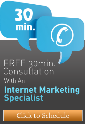
5. Test for Different Types of Customers. You have people visiting your site that are in different stages of the sales cycle, so it’s beneficial to create different CTAs to appeal to each kind of buyer. For example, a whitepaper or e-book might appeal to someone early on in the sales cycle who is just looking for educational information, while a free consultation or free trial might appeal to someone who is further in the sales cycle and closer to becoming a customer. You want to continually try new kinds of CTAs to see what resonates well with your customers. Don’t be afraid to use the steps above to try new things. You might be surprised what will get you more page views on the landing pages.
So there you have it, 5 tips for killer Calls-to-Action from an internet marketing consultant. It seems appropriate to end with a call-toaction, so if you’re ready to have a conversation about how to use internet marketing to get more clients for your business give us a call.


