
 Landing pages are an extremely important part of your internet marketing strategy as a business. Having landing pages is how you bring in leads and eventually (well, hopefully) convert them down the funnel and turn them into customers. But, unfortunately there are some mistakes that can destroy even the best landing pages out there. Read on to find out what those mistakes are so you don’t make them!
Overloading with Information
Don’t overwhelm the person who is arriving on your landing page. If they feel overwhelmed and don’t know where to look or where to insert their information to download the offer, they will leave. Remember, it only takes them a few seconds and one click for them to hit that back button.
The feeling of being overwhelmed can happen in many cases but often it is because there is too much text on the page. Text is scary! What do you do with a lot of text on a web page?
Not Offering Any Sort of Incentive
The best landing pages restate the value of why the visitor should be taking the time to download this offer, checklist or whitepaper. Their time is precious, so why should they wait the 30 seconds for this document to download? Convince them! Use active words that will make them feel like they’ve hit the jackpot when it comes to finding the free download that you are giving them.
Messy Design
No one likes a messy website or blog so of course people don’t enjoy messy landing pages as well. Keep it clean, concise and to the point! When it comes to your design make sure you are consistent, have crisp formatting, contrasting colors and the page ultimately flows easily.
Even one of these errors when it comes to design and the way it looks could potentially ruin even the best landing page.
Too Much “Fluff”
No need to feel like you have to slap pictures all over your landing page. You’ve already brought the person to this page, which means they are most likely interested in downloading whatever it is they have clicked on. Don’t scare them away by having a page that is cluttered with stock photography pictures. One will do, and actually it’s really a great idea to keep it consistent with the image that is on your call-to-action button (CTA). This way they know that they have indeed been directed to a page they expected to go to.
Having a Navigation
Probably one of the biggest, no-no’s! You’ve gone through the work of getting a potential lead to your landing page and now all you have is one more step, them entering their information—do not screw it up by giving them options to click elsewhere. If they see they have other options, they will consider them and may choose one of them.
When a person has options, in any situation, they weigh them, consider them and then chose what they wish to do. The best landing pages DO NOT give them this opportunity! If they really wish to get out of the landing page they can exit or hit the back button but they will have to make this choice themselves without any incentive from you.
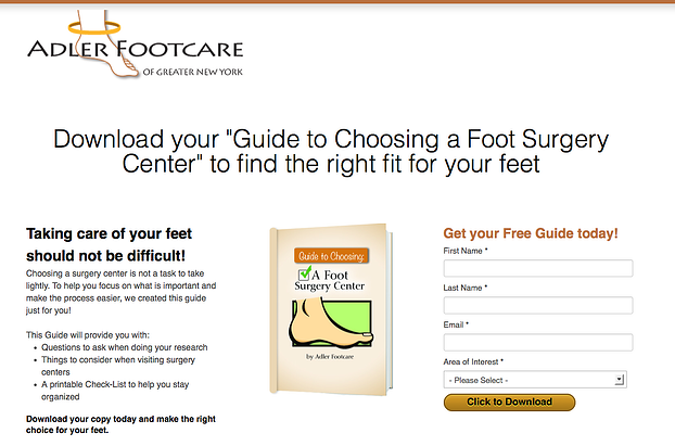
So let’s check out an example of a good landing page. This landing page is from a podiatrist’s website in New York. It’s a good example of a successfully made landing page because it’s:
- Clean
- Organized
- Offers an incentive
- Text is to the point (has bullets)
- Colors match
- Nothing too flashy
- No cheesy stock photos
- No navigation
- Has the company's logo
- Has a form submission
There you have it! Now that you know how to create the best landing pages and what not to do, it’s time to get to work on making some!
Related posts:
5 of the Best Landing Page Terms Every Business Owner Should Know
Create the Best Landing Pages for PPC

