
 Today will be a humorous but great learning experience. We will be viewing 3 landing pages that almost got the title as “Best Landing Pages” but turned out to be the “Best Landing Pages – Gone Wrong!”
This should give you an idea of what not to do. We have many blogs outlining the best practices for creating amazing landing pages. Here are a few blogs just in case you want to skip these disastrous landing pages and start designing the best landing pages like a pro!
The Best Landing Pages Should Take a Hint from In-N-Out Burger
5 Elements Your Best Landing Pages Are Missing (PPC Addition)
Personalization Makes the Best Landing Pages!
Let’s get right into things, let’s start with…
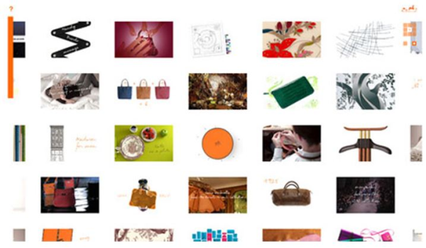
Hermes.com
 Picture Source: http://blog.kissmetrics.com
Something also to recognize is there is no header or navigation. This leaves the visitor wondering where to go or better yet where in the world they are.
If your landing page looks something like this then please consider reorganizing your content and at least adding some navigation or maybe a header?
If you have any other advice for this landing page please comment below.
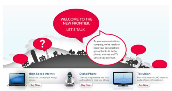
Frontier Communications
Picture Source: http://blog.kissmetrics.com
So here we have what may have made “the best landing pages” list but it fell short when you landed on this page to find confusing bubbles pointing in various directions and NO evident navigation bar! All you get on this page is a bunch of bubbles pointing to trees, towers and what looks like a dirty grey cloud.
Tip: If you want to design the best landing pages make sure your landing page doesn’t consist of 7 bubbles pointing to random objects on your site. This leaves the visitor clueless of what to do.
Question for our readers: What would you have put in these bubbles if you were a communications company? I’m lost of where to start…comment below.
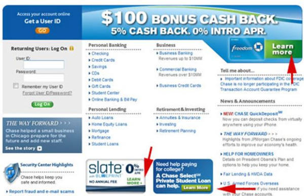
Chase
 Picture Source: http://blog.kissmetrics.com
For our final best landing pages gone wrong example, let’s take a look at Chase’s landing page here. Let’s first go over the objective of a landing page. Landing pages are meant to either collect your customer’s info or move them along in the lead generation process. I don’t know about you, but last time I took a landing page design course it didn’t recommend you place three different calls-to-action on a landing page all addressing three different products.
When a visitor lands on a landing page they should be able to focus on one main point. You want them focusing on the meat of the page and if you have a side salad, dessert and cream puffs laying around it’s going to be hard to stay focused on the task you’re asking your visitor to complete.
Tip: Keep your landing pages simple. Focus on one topic and reduce the option to get sidetracked with other offers. The majority of people have calls-to-action ADD - they look around at all their options when they have them.
Stick to one contact form, one offer, and one path.
What have we learned?
Well if you ask me, we’ve learned that the best landing pages don’t look like any of these examples that’s for sure!
For those of you who stuck around this long I would like to encourage you with a little video of what good landing pages should look like. Take a look at this video and let me know what you think in the comment section below. Would you add anything?
Happy Landing Paging!

